I mentioned that one reasonable way to show data from multiple trials of an experiment is using a boxplot, also known as a box-and-whisker plot. Here I'll show one way to generate one variant of this kind of lot. Others are also reasonable; talk with me if you've got something particular you want to show in your lab report.
Start by putting your data in a "CSV" file, that is a "comma separated values" file. To see what such a file looks like, you can look at the example data I'll use, which I've linked here as sample.csv. You can either directly put your data into this format or initially put your data in a spreadsheet and then ask the spreadsheet program to save your data as a CSV file.
We can use the R system, a free statistics package, to plot this data. The R system is installed on the MCS lab macs and you can also download your own copy if you would prefer. (It is available for a variety of platforms.)
Once I launched R, I entered the following two commands to read the CSV file into an R variable named sampleData and then graphically summarize that data in a boxplot:
sampleData <- read.csv("Desktop/sample.csv")

boxplot(FLOPS ~ size, data=sampleData, range=0, main="Sample Plot", ylab="FLOPS", xlab="matrix size")
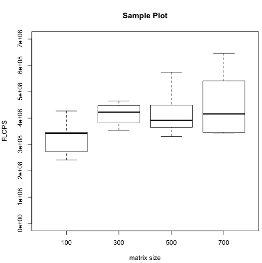
The resulting boxplot popped up in a separate window:
The dark horizontal line in each box indicates the median of the respective data set. You can see that in my entirely fictitious data, the median FLOPS rate was lowest for matrix size 100. The lighter box surrounding each median indicates the middle half of the data, that is the range from the 25th to 75th percentile. The protrusions beyond the boxes (known as "whiskers") indicate the full range, all the way from the slowest trial up to the fastest.
From the ranges spanned by the whiskers, you can see at a glance that in my (fictitious) experiment, there was some overlap between the FLOPS rates for the different sizes. As such, it would be risky to conclude that there is any relationship between matrix size and FLOPS. However, you can also see that most of the data from matrix size 100 was less than most (or even all) of the data from the larger matrix sizes. As such, it would be reasonable to suggest for further investigation the possibility that matrix size 100 has a lower FLOPS rate than the other sizes, but that the larger sizes all have similar FLOPS rates to each other. Of course, your actual data may tell an entirely different story.
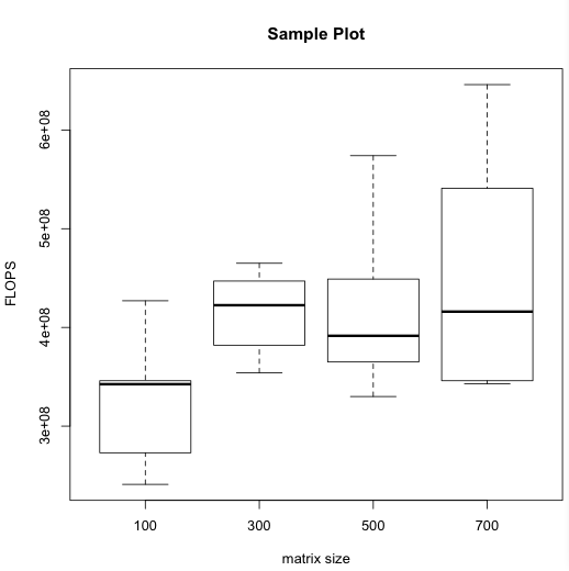
You may notice that the vertical (FLOPS) axis of this plot doesn't start at 0. That makes it easier to compare the different ranges, but exagerates how broadly spread the data appears to be. You might consider an alternative plot in which the axis starts at 0. You could generate it by adding an extra ylim option to the boxplot command:
boxplot(FLOPS ~ size, data=sampleData, range=0, main="Sample Plot", ylab="FLOPS", xlab="matrix size", ylim=c(0,7e8))